SIGNAGE & WAYFINDING SYSTEM
S F S U
J. PAUL LEONARD LIBRARY
Project Members: Lois Chen | Shanshan Lei | Xinping Li
Introduction | Observation | Analysis


Introduction: We aim to design a series of signs to guide students to navigate the space more easily. We will create new signage for students to find their way easily using bright colors and simple icons.
Observation: The entrance to the school had no clear direction signs and the site map was visible to direct people, so it was difficult for people to find where they were going.
Analysis:
• Using bright colors
• Squares and irregular shapes
• Reducing heavy text
• Using simple fonts
• Creating simple and obvious contrasts makes the logo more attractive
Inspiration & Drivers
The color scheme, simple icons, and the square and rectangle shapes as our main inspirations on wayfinding design. Also, the floor sign will be a part of our design.
We want our signs to simple and easy to recognize.
The design was driven by using voice technology input to help people quickly get where they need to go.


Signage System


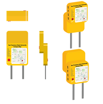
Site Map
Building Locator
Building Directory
Hallway Signage
Hang on the ceiling
We have redesigned the signage system that make it more simple and attractive by using a bright and strong contrast color scheme and simple icons. To achieve this design, we mostly use rounded cubes and yellow and black colors.
Building Sign

Room Sign
Braille
Floor Sign
Design Guide
Shape
Font
We mainly use rounded squares and irregular shapes for our project. It is simple and clear to guide people on the wayfinding.

Roboto is a sans serif font. Roboto has a dualnature, and the font features friendly and open curves. It allows letters to settle into its natural width. This makes for more natural reading.
Roboto - Light
Roboto - Medium
Roboto - Bold
Color
In the color scheme, we will use yellow, red, and black. We mostly use the main colors which are yellow-orange and black.
Yellow
#ffcb00
Red
#bc001f
Black
#000000
Universal Design Principle
1. Equitable Use
Disability-access, Target entrance provides wheelchair ramps for disabled people to use.
Location: Target
2. Flexible Use
This drinking fountain with a bottle filler station is not required to press the button to fill it with water, as long as people put the bottle on the station, it will automatically come out.
Location: J. Paul Leonard Library
3. Simple and Intuitive Use
The Emergency Phone design is very easy to understand by using intuition and colors.
Location: SFSU
4. Perceptible Information
The MUNI bus station has an audible and tactile button for users to get information. This design is valid for the hearing or vision impaired.
Location: SFSU bus station
5. Tolerance for Error
The walking trail has been designed with edge protection along both sides of the path. The edge protection serves as a safety measure by keeping people from walking or rolling off the trail unintentionally.
Location: Salesforce Park
6. Low Physical Effort
This door knob design can be used efficiently and is easy to use even for users who are not very strong. The door handle can be opened by pressing down, which avoids the grasping action of the round head handle.
Location: J. Paul Leonard Library
7. Size and Space for Use
The Bart entrance and exit can accommodate the width of a wheelchair.
Location: Balboa Park Station

1

2


3

4

5

6

7
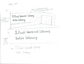
Concept Sketch


Mock-Up Models


Signage Applications (Frond View / Side View / Top View)
Site Map
The sitemap is convenient for all people, especially for disabilities person. It located on 19th Ave and Holloway Ave in SFSU.

Building Directory
The building directory is on the wall in front of the elevator.
The white color of the content points out people standing in which layers of the building.
Building Sign

The building sign is on top of the entrance. The bright color will attract
people to look at it.

Hallway Sign
Hallway sign is on top of the wall and direction arrows on the floor. It gives people having fun on the wayfinding.

Building Locator
Building locator is next to the Administration building. When people walk around the campus, it can guide them easily to find their places.

Room Sign
Room sign is next to the door on the wall. Room number will be bigger and the color is bright. It gives people easily to see it and find it.
Conclusion
http://graphicambient.com/2014/04/22/eo-signage-system-france/
https://99designs.com/blog/design-other/how-graphic-design-helps-us-navigate-built-environments/
http://tallersmariavictrix.blogspot.com/2014/06/seleccion-recursos-innovadores-senalizacion.html
In this project, we chose Holloway and 19th Street, for the main entrance to the university and across the campus that leads to the library.
We consider texts and color schemes to be the main factor problems in our school wayfinding system. It is hard to attract and navigate because the signs don’t catch the student’s attention.
Therefore, we choose a bright and intense color scheme. Also, we use the Rotobo typeface because of its natural reading.
We hope that our signage and wayfinding system design will show better and different navigation for students.
Bibliography